

Designing a Google Wallet Pass That Holds Up in the Hand
 By the Kemicard team
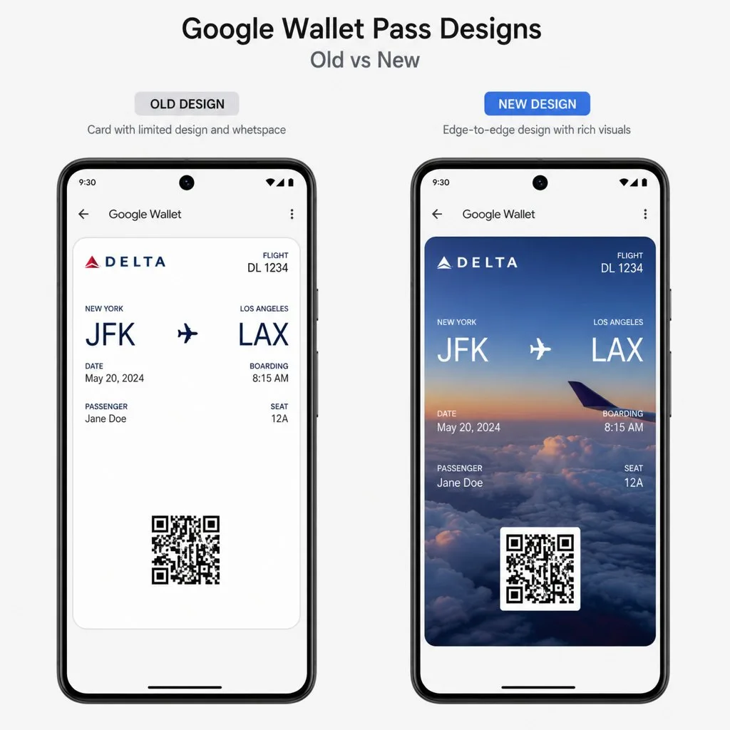
Most passes are designed on a large monitor and used on a phone, in a queue, by someone who is not paying full attention. Almost every design mistake in a wallet pass follows from that gap. Here is what survives contact with the real conditions.
Design for the list, not the detail view
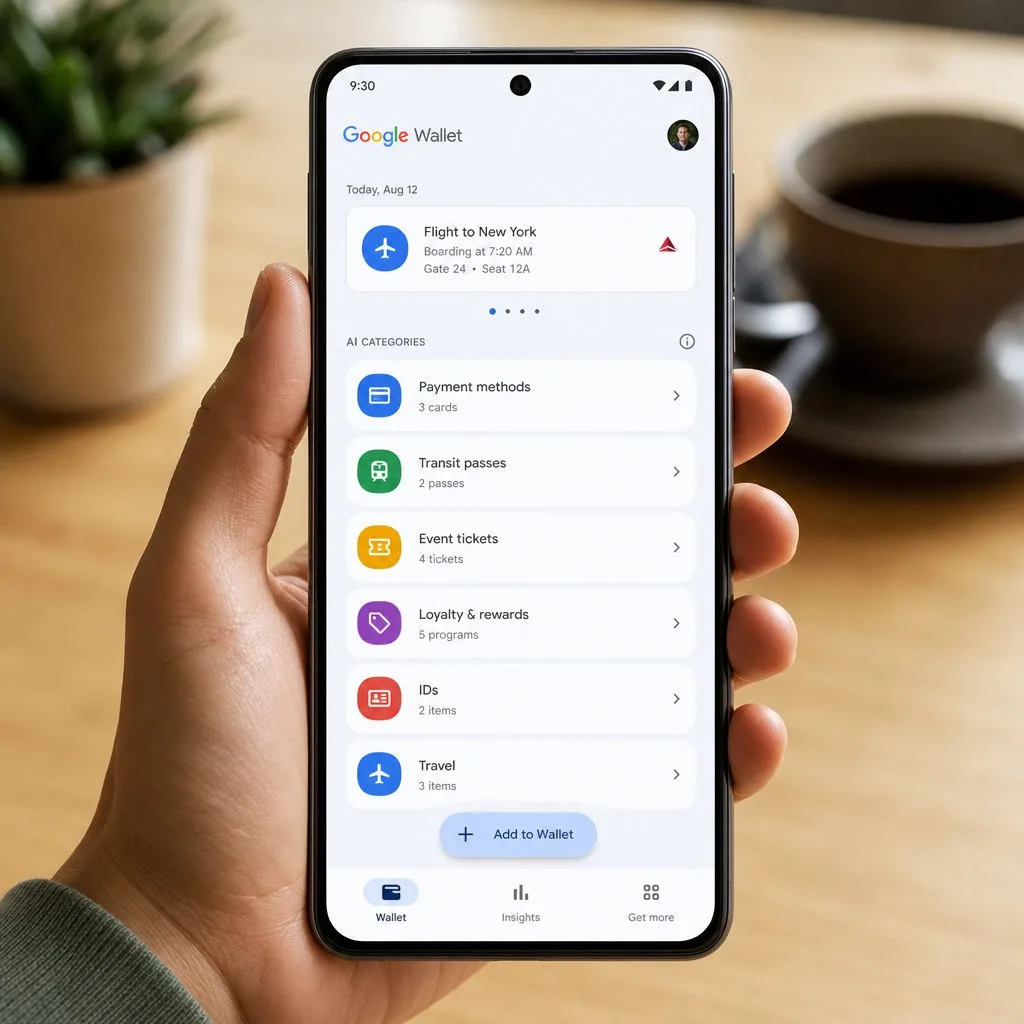
The screen you spend your time perfecting is not the screen most people see. A wallet is a stack, and a pass first appears as a compressed row — a logo, a colour and a line of text. If your pass is unrecognisable at that size, the holder scrolls past it.
Which means the two decisions that matter most are the ones designers usually treat as trivial: the logo, and the background colour.
- The logo must read at about 30 pixels. A wordmark with fine lettering becomes a grey smudge. Use the mark, not the full lock-up.
- Pick a colour nobody else in the wallet owns. Your brand navy competes with every bank card. If your palette allows a distinctive secondary, this is the place for it.
- The header text is the identifier. "Meridian Fitness — Gold" is useful. "Membership Card" is not, because every pass is a membership card.
One thing on the front
The single most common failure is trying to show everything at once. The front of a pass answers one question, and you should decide which.
For a loyalty card it is the balance. For a ticket it is the seat or the gate. For a membership it is the tier and expiry. For an ID it is the name and photo. Everything else belongs on the back, where there is room and no time pressure.
A useful test: hand the pass to someone who has never seen it and ask what it tells them in two seconds. If they have to read, redesign.
Contrast is an accessibility requirement, not a preference
Passes are read outdoors, in bright sun, by people with a range of vision. Light grey text on a mid-tone brand colour looks refined in a design tool and fails completely on a phone at a stadium gate.
Hold to a proper contrast ratio between text and background, and check the pass on an actual device outdoors before signing it off. This is also the case where the platform's own default styling is often better than a custom one.
The barcode has physical constraints
- Leave the quiet zone alone. The clear margin around a code is part of the code. Cropping it to fit a layout breaks scanning in ways that are hard to diagnose later.
- A centred logo is fine within limits. Error correction absorbs a modest one. A large one, or one placed off-centre, does not.
- Do not invert. Light code on a dark field fails on a meaningful share of scanners.
- Test on the hardware you will actually use — the reader at the door, not your own phone camera in good light.
The back of the pass is underrated
Nobody designs the back, and it is where a pass earns its keep after the first use. It holds the things people need at an awkward moment: opening hours, the phone number, the terms, the address, the link to change a booking.
Every one of those is a support call you do not receive. Treat the back as a small, permanently available help page rather than a legal dumping ground.
Delivery problems that look like design problems
Two issues account for most "the pass is broken" reports, and neither is about the design.
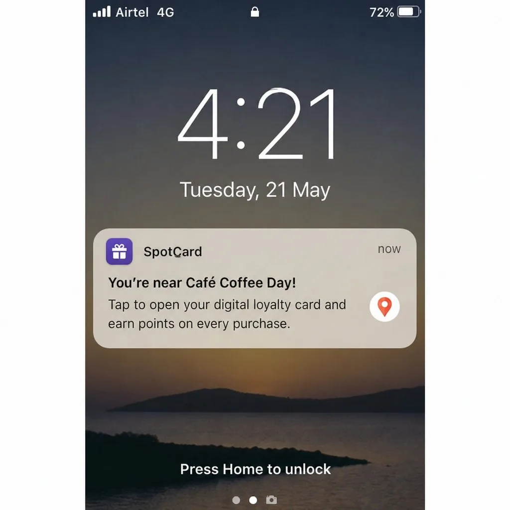
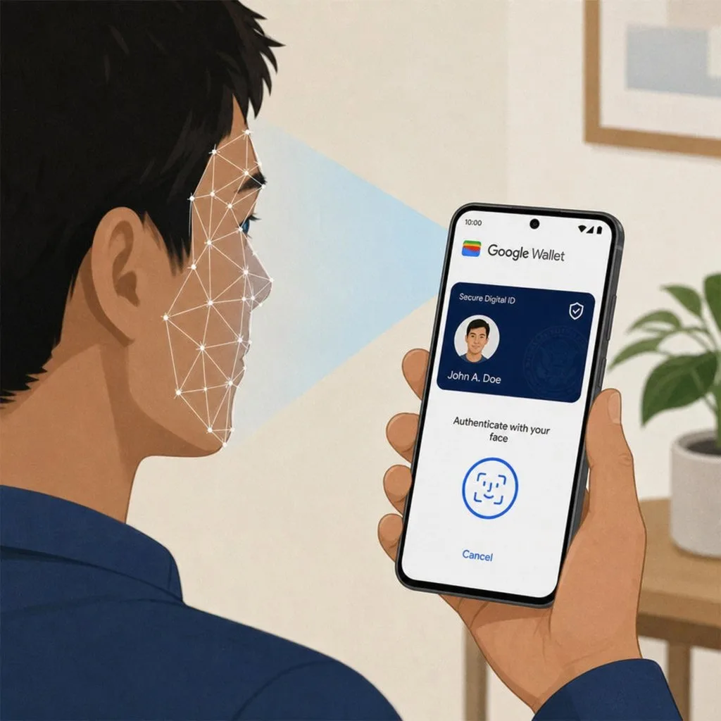
- No screen lock set. Google Wallet requires a device screen lock before a pass can be saved. Users read the refusal as a broken link. Saying so on the add-to-wallet page removes most of these.
- Notifications declined at install. Your updates then arrive silently and you conclude the channel does not work. It is worth explaining what you will send at the moment you ask.
Design once for both platforms
Apple Wallet and Google Wallet differ in packaging and in some layout specifics, but a pass designed to the constraints above works on both. Designing separately for each is how organisations end up with two brands. See Apple Wallet vs Google Wallet for the differences that genuinely require attention.
Kemicard renders one template to both platforms from the same Salesforce record, so a design change is made once. See how it works.
FAQ
- Can I change a pass design after issuing it? Yes — passes already on devices update. It is one of the real advantages over print.
- How large should the logo file be? Supply it well above display size so it stays sharp on high-density screens; the platform downsamples.
- Should the pass match our app? Match the brand, not the app UI. A pass is a card, not a screen.
- Can I use a photograph as the background? Usually a mistake — text contrast becomes unpredictable. Put imagery in the hero area and keep the field background flat.
Explore Kemicard
Product & solutions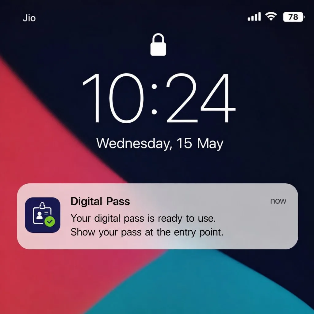
One Template, Both Wallets
Book a demo, test drive Kemicard, or start a free 30-day trial.
 Start Free Trial